Everyone has opinions about e-commerce design. Most of them are recycled from the same blog posts. Here's what we've actually observed working with brands selling physical products online.
The Product Page Is Everything
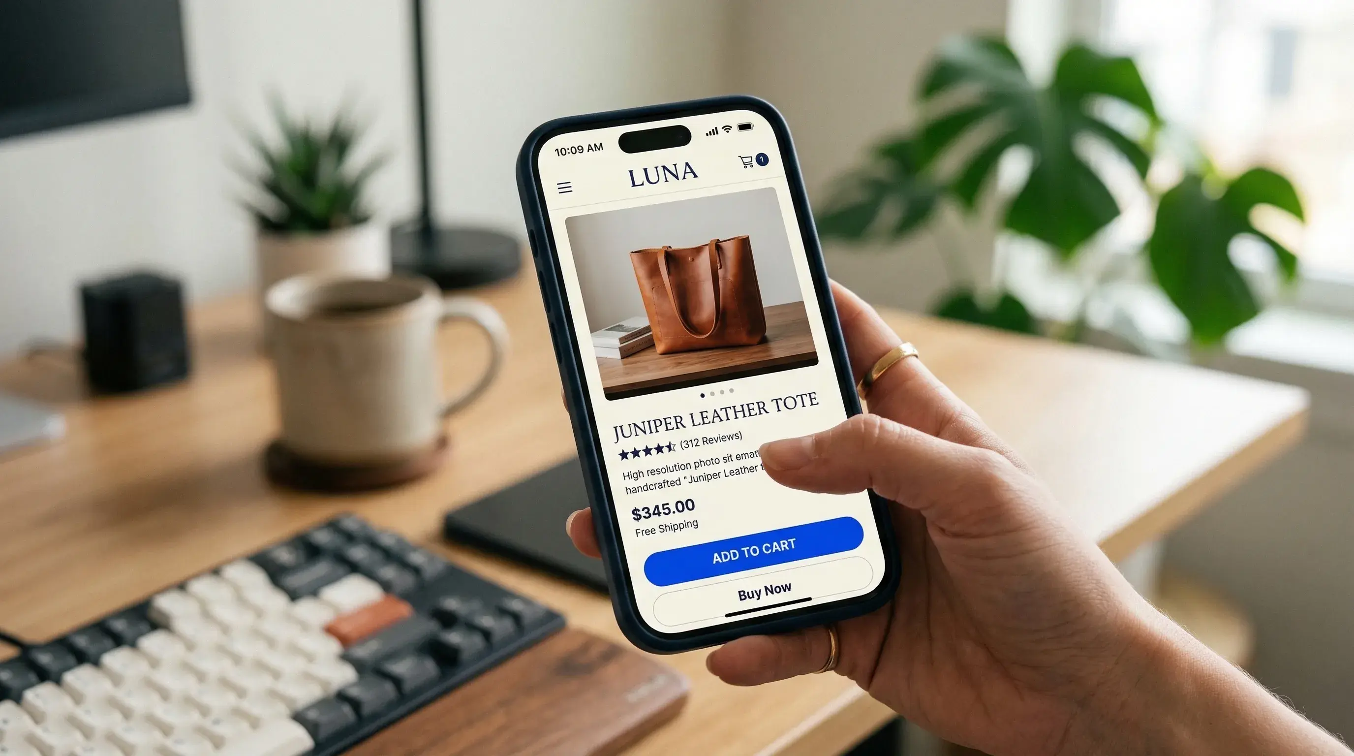
Your product page does more work than your homepage. Treat it accordingly.
The hierarchy should be:
- Product image (large, zoomable, multiple angles)
- Price (clear, no hunting)
- Add-to-cart button (visible without scrolling on mobile)
- Everything else
Anything that pushes the buy button below the fold on mobile is costing you sales. We've seen conversion lifts of 12–18% just from restructuring the above-the-fold content on mobile product pages.
Photography Over Polish
We've seen plain white-background product shots outperform elaborately styled lifestyle images. Not always, but often enough that it's worth A/B testing.
When clarity wins: Functional products, tech, accessories, anything where the customer needs to see exact details before buying.
When lifestyle wins: Fashion, home decor, food. These are products where context and aspiration drive the purchase.
The takeaway: don't default to one approach. Test both and let the data decide.
Micro-Interactions Build Confidence
A subtle animation when adding to cart. A smooth transition when selecting a size. A gentle confirmation when a wishlist item is saved.
These small moments reduce the cognitive gap between browsing and buying. They make the experience feel responsive and trustworthy. Specific ones we always implement:
- Add-to-cart: Button state change + cart icon animation (150ms)
- Size/variant selection: Smooth image swap with crossfade
- Wishlist save: Heart fill animation with a subtle bounce
- Stock urgency: Gentle pulse on "Only 3 left" (not aggressive; builds urgency without feeling manipulative)
The Checkout Reality
Nobody reads your checkout page copy. They scan for:
- Total price (including taxes)
- Shipping cost (or "Free shipping," the most powerful two words in e-commerce)
- Payment logos (trust signals)
- The button
Design accordingly. Remove everything that isn't one of those four things and watch your completion rate improve.
Quick Wins We Implement on Every Project
- Sticky add-to-cart on mobile: always accessible as the user scrolls through product details
- Progressive image loading: blur-up placeholder so the page never feels empty
- Smart defaults: pre-select the most popular size/color variant
- Exit-intent offers: not popups, but a subtle sticky bar with a discount code
- Real-time shipping estimates: "Order in 2h 14m for next-day delivery"
We approach every e-commerce project with this mindset: measure what matters, design what converts, and test everything else.


